Sevaxa
The marketing homepage for a healthcare incident-reporting platform — built to earn the trust of cautious hospital buyers and turn them into booked demos.
Sevaxa is a B2B SaaS platform helping hospitals and clinics report and track medical incidents, with the goal of catching patterns before they repeat. This case study covers the marketing homepage — the page whose only job is to turn a hospital decision-maker into a booked demo.
Sevaxa is sold to hospital leadership — not to the individual who files a report.
That changes everything about the page. Healthcare buyers are cautious and slow to commit, and the people who sign off — medical directors, quality and risk leads — care about exposure, compliance and proof. The homepage had to build trust and communicate risk reduction quickly, then point everyone at one action: book a demo, not a self-serve signup.
Every section answers the next question a buyer would ask.
I structured the page as a single argument, top to bottom: hook the problem, prove it matters, show the product doing the work, back it with evidence, and ask for the demo. Here’s the page as I designed it.
One promise, one product glance, one button. “Take control of every incident” pairs a confident line with a live look at the reports table — and a single “Book a demo.”
Before selling features, the page states the stakes — “most harm in healthcare is preventable” — then answers a cautious buyer’s first three objections: exposure, security & GDPR, and insight.
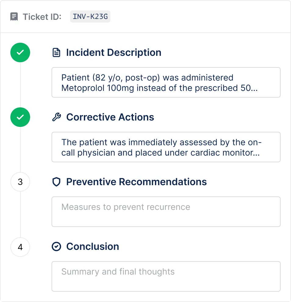
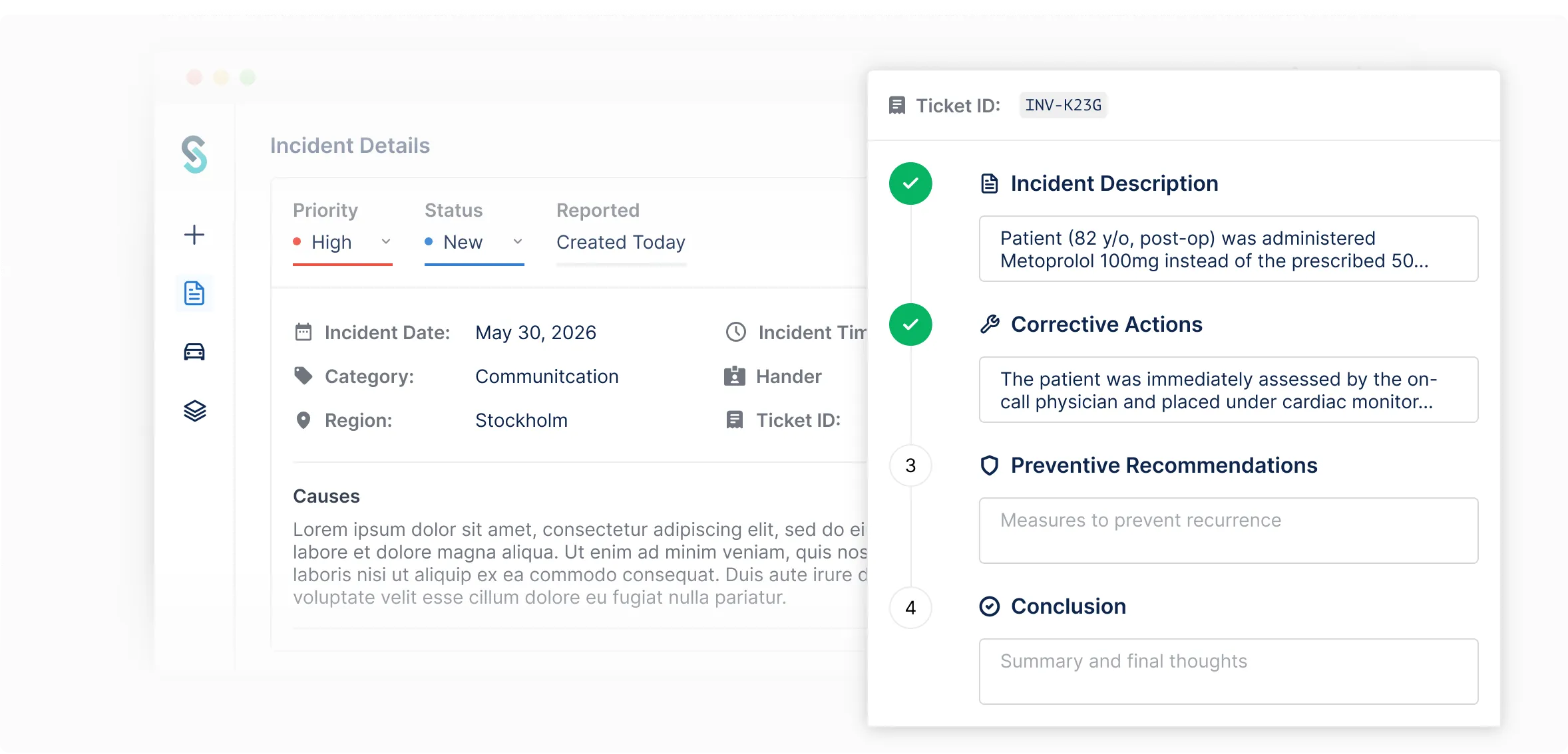
“Capture the full picture of every incident.” A real screen shows the structured, step-by-step report — description, corrective actions, prevention — so buyers see the workflow, not a feature list.
Capture the full picture of every incident
Teams log what happened in a structured, step-by-step report — capturing the incident description, corrective actions taken, and preventive recommendations, all in one place while the details are still fresh.
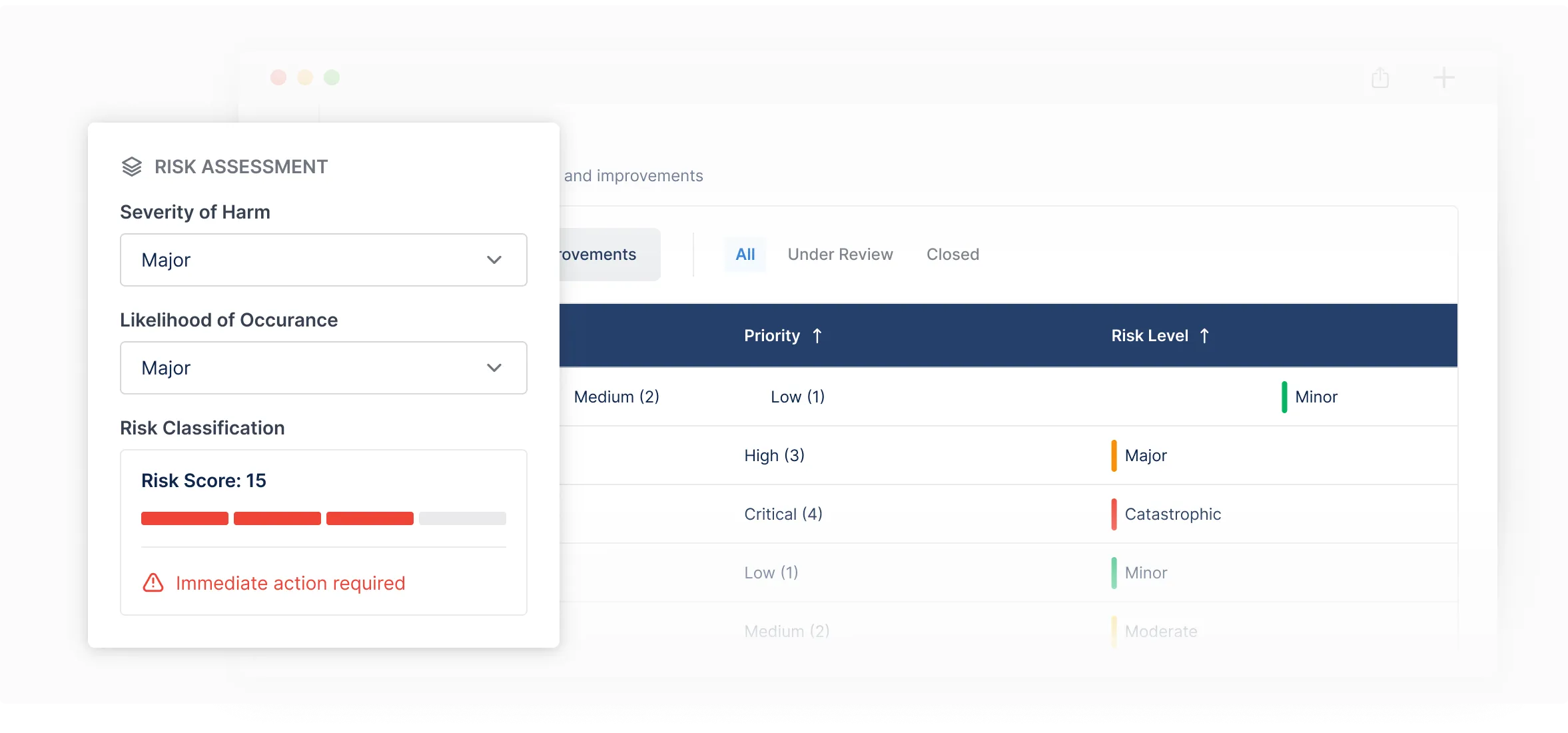
“See what’s major at a glance.” The risk-scoring panel and the colour-coded table speak directly to the buyer’s real fear: knowing what to act on first.
See what’s major at a glance
Every report is scored on severity and likelihood, then colour-coded by risk level, so major incidents stand out from minor ones, and your team always knows what to act on first.
Right before the ask: hard proof points and a named voice from the field. A medical director’s words do more for a cautious buyer than any feature could.
The page ends where it has been pointing all along: “Bring every deviation into one system,” and the same “Book a demo” — framed as a short, no-commitment walkthrough.
Why “Book a demo,” not “Sign up free.”
Most SaaS homepages chase a self-serve signup. Sevaxa shouldn’t. Healthcare buyers don’t adopt a system that touches patient safety on impulse — there are stakeholders, procurement, and compliance to satisfy first. A “sign up free” button would collect the wrong people and stall the right ones.
So the whole page is built to qualify and convert toward a demo instead of an instant account. The structure does the selling, the proof lowers the risk, and the CTA invites a guided sales conversation — the way this kind of decision actually gets made.
I shaped the structure; we shaped the words together.
I owned the structure and hierarchy — what each section needed to do, and in what order. The marketing lead refined the messaging and copy, and we iterated together to land on language that felt both trustworthy and clear for a healthcare audience: confident without overpromising, plain without sounding generic.
The hero line is a good example. An early direction leaned conceptual — “Catch the pattern before it becomes the incident” — but it asked the reader to do a little work. We tested it against something more direct and landed on “Take control of every incident,” which says the benefit plainly and still respects the gravity of the subject.
The homepage was designed to build trust quickly with risk-averse healthcare buyers and drive qualified demo bookings. Every choice on the page ladders up to that single goal.
The whole page, end to end.
Every section in one scroll — the order, the rhythm, and the single action it all points toward.